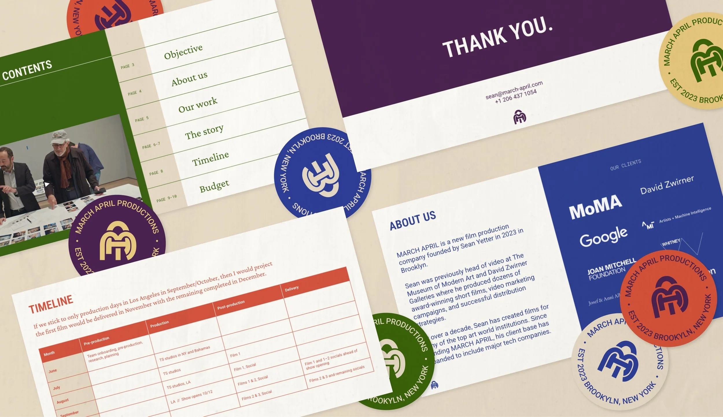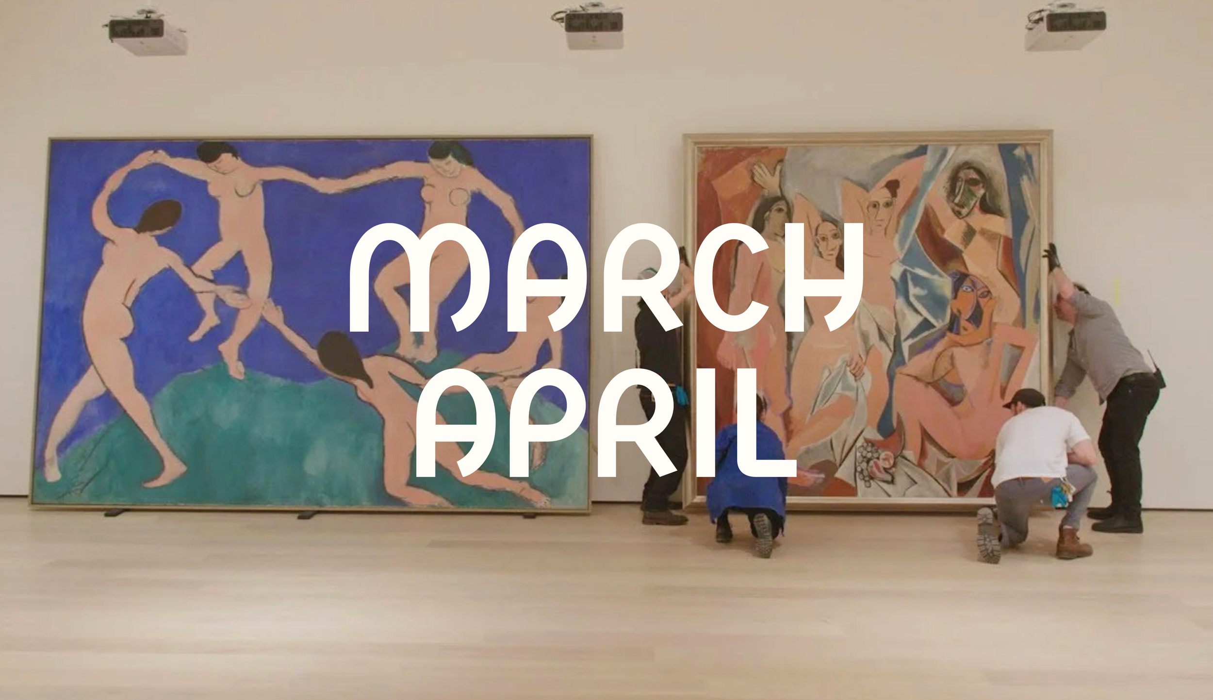
Branding for a production company working with art institutions and commercial brands
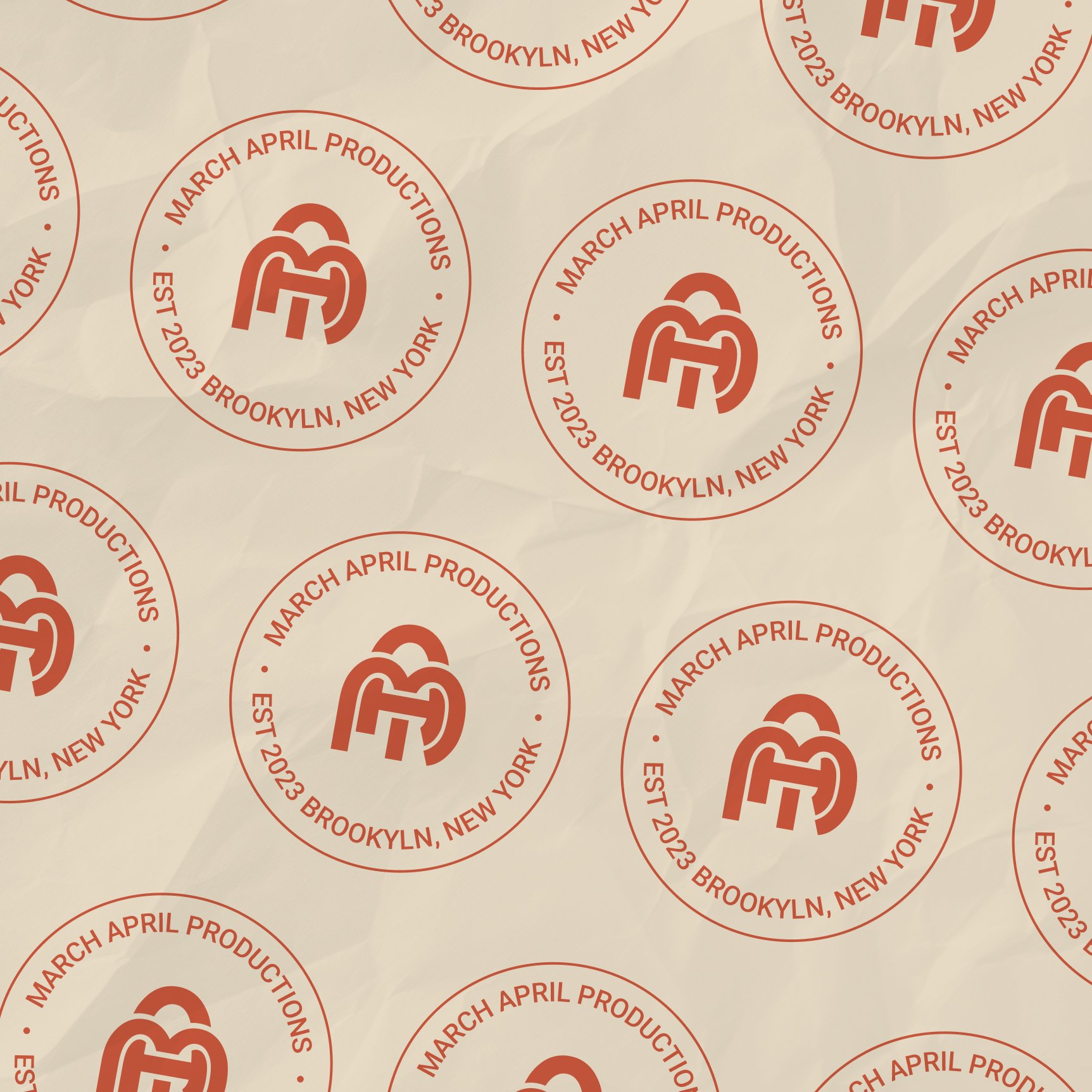
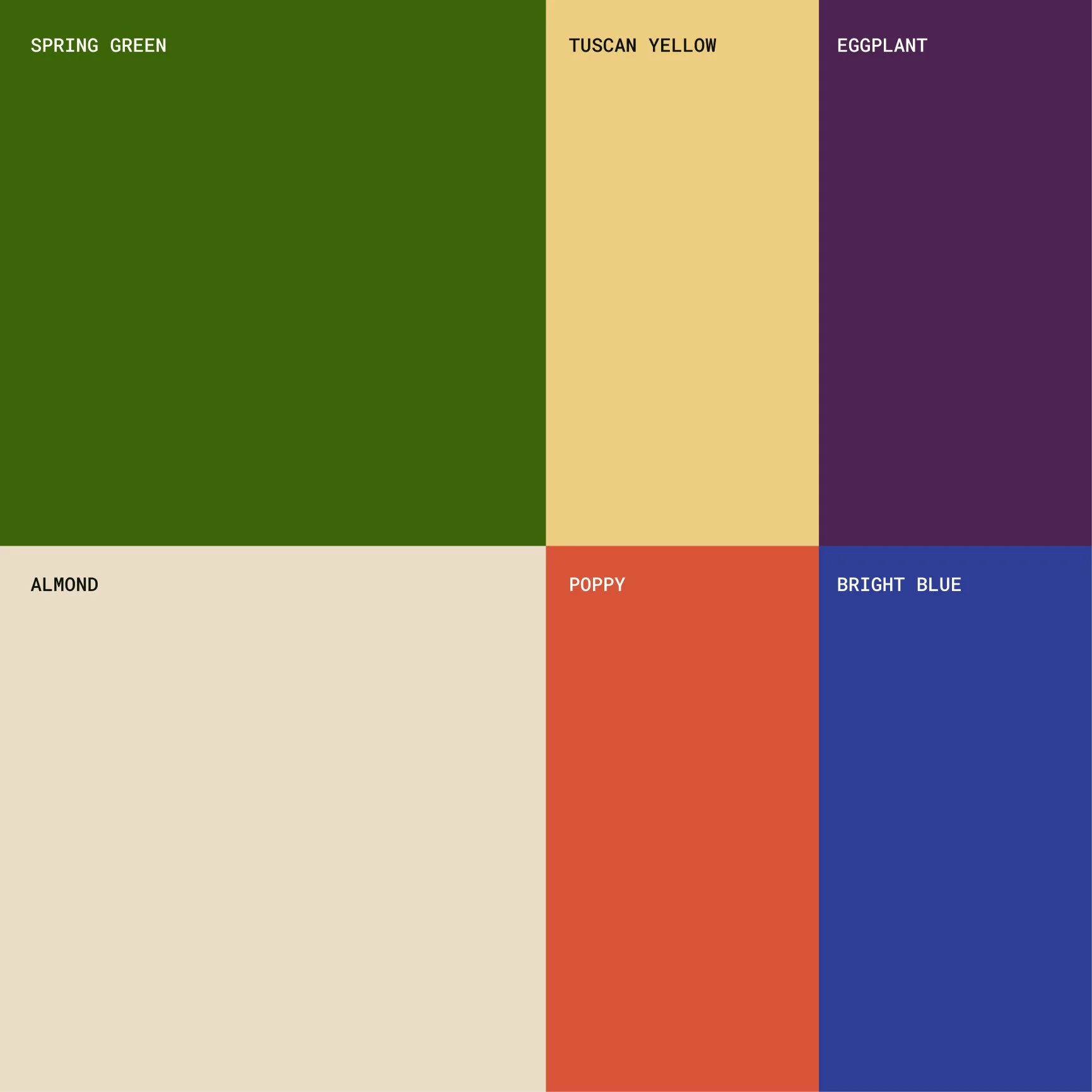
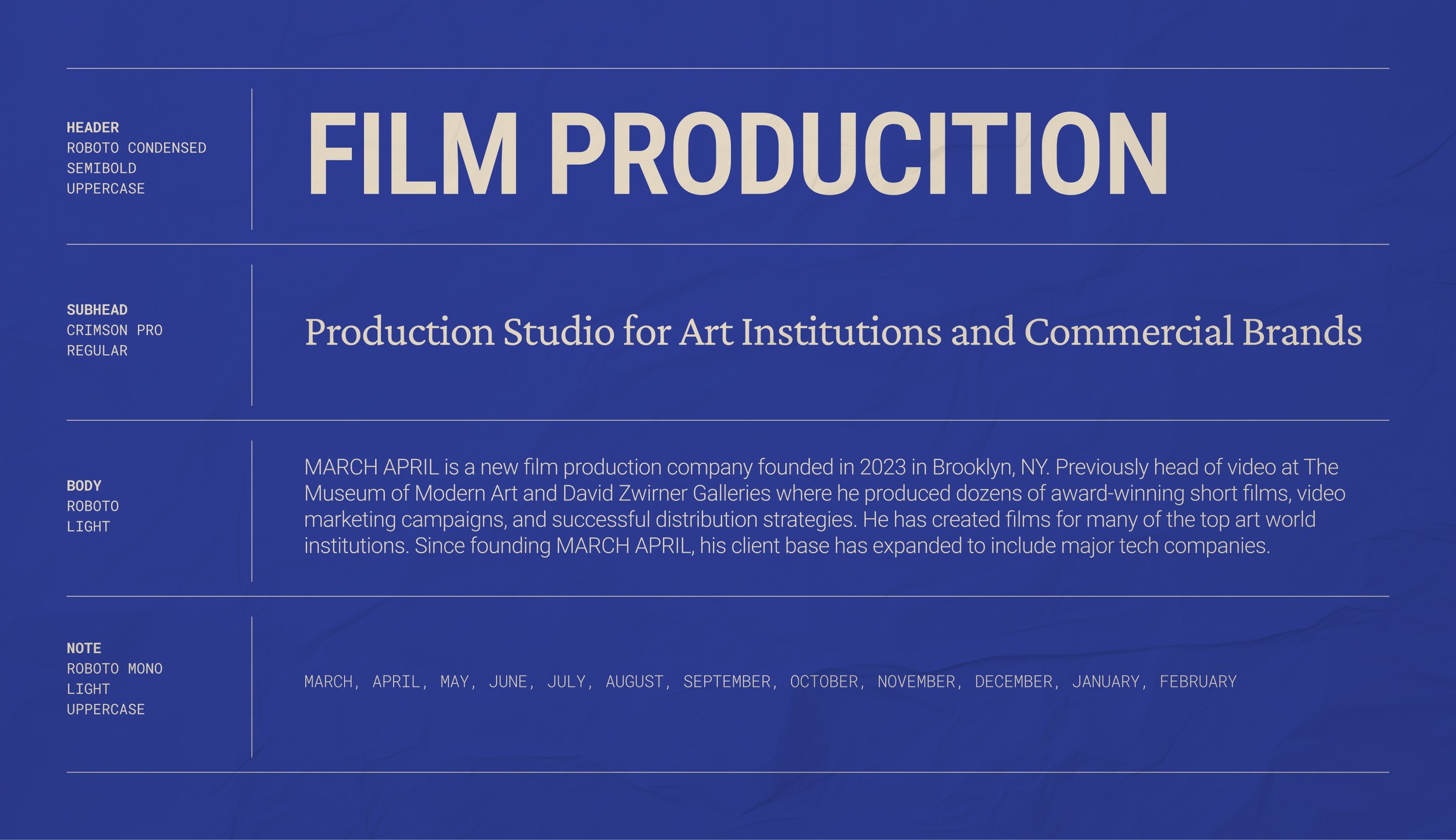
EC Studio developed a brand identity for March April, a production company creating short films for the art institutions and commercial brands. Serving both industries, the identity needed to be eye-catching and memorable while still speaking to each audience equally. To this aim, the palette deliberately steps away from the art world's black-and-white convention, instead, the palette is rich and saturated. The logo is built around a playful typeface with a nod to Art Nouveau letterforms. It is paired with a confident display headline and a functional serif and sans serif font to round out a flexible working system. The result is a brand identity that is memorable at a glance and adaptable enough to move between markets.
Services:
Branding